
최근 논문을 준비하면서 뭔가 여러조건에 대한 legend를 작성하면서 심심하다는 느낌을 많이 받았습니다. 다른 논문들을 보다보면 제법 예쁘게 legend를 표로 작성하여 삽입하곤 하는데, 그러한 부분들을 matplotlib내에서 자체적으로 해결하고자 ChatGPT 및 Copilot와 함께 작업했습니다. 생각해보면 AI의 발전 등을 통해서 원하는 바를 훨씬 손쉽게 작성할 수 있게 된 것 같습니다만, 그럼에도 불구하고 제법 이런저런 반복적으로 style을 정립하기까지 시간이 어느정도 걸린 것 같네요.
기본적인 style의 정의등은 다음 글들에 정의된 figure style과 색상코드를 따라갑니다.
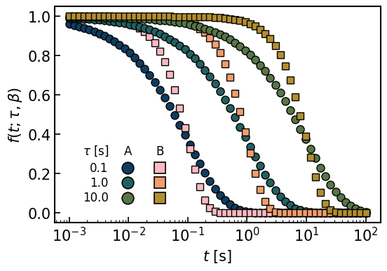
여기서는 손쉽게 stretched exponential function을 조건에 따라 그래프로 그린 것입니다. 주어진 조건은 A와 B로 구분되고, A와 B모두 tau로 정의된 조건 1,2,3번이 주어져 있습니다. 거기에 따라 symbol이 정의된 경우입니다. 조금 더 복잡한 것에 대해 여러가지 조건들을 함께 첨부한 버전도 있는데, 이것은 사용에 fine tuning이 필요하다보니 단순히 카테고리 x 조건의 숫자가 정해진 경우의 테이블을 활용하는것만 여기에 첨부 해 두었습니다.
먼저 table형태의 legend를 만들어주는 함수를 정의합니다. 이는 기본적으로 주어진 그래프 위에 그림을 그리는 형태로 나타납니다.
from mpl_toolkits.axes_grid1.inset_locator import inset_axes

def draw_matrix_legend(ax, row_labels, col_labels, shapes, colors,
                       fontsize=12, xscale=0.5, yscale=1.3,
                       row_header_text=None, border=False, gaps=[0.1, 0.25, 0.02], ms=12, facecolor='none', mec='k', alpha=1.0):
    """
    Draw a matrix-style legend on the given axes `ax`.
    `colors` is a list of lists with shape (n_rows, n_cols).
    """
    nrows, ncols = len(row_labels), len(col_labels)

    # empty table (row labels only) – we add column headers manually
    table = ax.table(
        cellText=[[""]*ncols for _ in range(nrows)],
        rowLabels=row_labels,
        cellLoc="center",
        loc="center",
        fontsize=fontsize,
    )
    table.auto_set_font_size(False)
    table.set_fontsize(fontsize)
    table.scale(xscale, yscale)

    # style: remove cell borders, right-align row labels
    for (_, _), cell in table.get_celld().items():
        cell.set_linewidth(0)
    for i in range(nrows):
        tlab = table[(i, -1)].get_text()
        tlab.set_fontsize(fontsize)
        tlab.set_ha("right")

    # optional: tweak column widths independently
    # row-label column
    for i in range(nrows):
        table[(i, -1)].set_width(gaps[0])
    # data columns
    for i in range(nrows):
        table[(i, 0)].set_width(gaps[1])
        if ncols > 1:
            table[(i, 1)].set_width(gaps[2])

    ax.figure.canvas.draw()  # finalize layout before querying positions

    # plot markers at cell centers
    for i in range(nrows):
        for j in range(ncols):
            if colors[i][j] is None:
                continue
            cell = table[(i, j)]
            x, y = cell.get_xy(); w, h = cell.get_width(), cell.get_height()
            xc, yc = x + w/2, y + h/2
            ax.plot(xc, yc, shapes[j], ms=ms, mfc=colors[i][j], mec=mec, mew=1.2, alpha=alpha,
                    transform=ax.transAxes, clip_on=False, zorder=3)

    # column headers above the first row
    header_offset = 0.2
    header_texts = []
    for j, lab in enumerate(col_labels):
        c0 = table[(0, j)]
        x, y = c0.get_xy(); w, h = c0.get_width(), c0.get_height()
        xc, ytop = x + w/2, y + h
        txt = ax.text(xc, ytop + header_offset*h, lab, ha='center', va='bottom',
                      transform=ax.transAxes, zorder=4, fontsize=fontsize)
        header_texts.append(txt)

    # optional row-header (title) above the left labels
    if row_header_text:
        rl = table[(0, -1)]
        xr, yr = rl.get_xy(); wr, hr = rl.get_width(), rl.get_height()
        ax.text(xr + wr/2, yr + hr + header_offset*hr, row_header_text,
                ha='center', va='bottom', transform=ax.transAxes,
                zorder=4, fontsize=fontsize)

    # optional border around the block
    if border:
        from matplotlib.patches import Rectangle
        from matplotlib.transforms import Bbox
        renderer = ax.figure.canvas.get_renderer()
        bbox = table.get_window_extent(renderer)
        for t in header_texts:
            bbox = Bbox.union([bbox, t.get_window_extent(renderer)])
        # padding
        bbox = bbox.expanded(1.06, 1.18)
#        bbox = bbox.expanded(1.6, 1.18)
        # add ASYMMETRIC padding (pixels) — give more on the LEFT
        pad_left, pad_right, pad_top, pad_bottom = 10.0, 6.0, 8.0, 8.0
        bbox = Bbox.from_extents(bbox.x0 - pad_left, bbox.y0 - pad_bottom,
                                 bbox.x1 + pad_right, bbox.y1 + pad_top)

        bbox_ax = ax.transAxes.inverted().transform_bbox(bbox)
        ax.add_patch(Rectangle((bbox_ax.x0, bbox_ax.y0),
                               bbox_ax.width, bbox_ax.height,
                               facecolor=facecolor, edgecolor='k', lw=1.0,
                               transform=ax.transAxes, zorder=10))
다음은 실제로 그래프를 그리는 부분입니다. 먼저 row_lables, col_labels, shapes, colors를 정해주는데 이는 나중에 legend에서 사용할 정보들을 저장합니다. 그래프를 그리는 plot부분은 그냥 테스트용으로 생성한 것입니다. 마지막에 legax과 draw_matrix_legend에서 위의 정보들을 호출해서 실제로 그래프 형태로 나타냅니다.
tau_arr = np.logspace(-1,1,3)
N_tau = len(tau_arr)

colP_A = cm.batlow(np.linspace(0.1, 0.4, 3))
colP_B = cm.batlow(1.-np.linspace(0.1, 0.4, 3))

row_labels = [f'{tau_arr[i]:.1f}' for i in range(N_tau)]
col_labels = ['A', 'B']
shapes = ['o', 's']
colors = [
    [colP_A[0], colP_B[0]],
    [colP_A[1], colP_B[1]],
    [colP_A[2], colP_B[2]],
]

style_A = {
    'linestyle' : 'none',
    'ms' : 8,
    'marker': 'o',
    'mec' : 'k',
    'mew' : 1.0,}


style_B = {
    'linestyle' : 'none',
    'ms' : 7,
    'marker': 's',
    'mec' : 'k',
    'mew' : 1.0,}

Ndat = 40

t_ref = np.logspace(-3, 2, 60)
beta_1 = 0.7
beta_2 = 1.5

fig, ax = plt.subplots(figsize=(6,4))
for i in range(N_tau):
    tau = tau_arr[i]
    plt.plot(t_ref, np.exp(-(t_ref/tau)**beta_1), **style_A, c=colP_A[i])
    plt.plot(t_ref, np.exp(-(t_ref/tau)**beta_2), **style_B, c=colP_B[i])
plt.xscale('log')
plt.tick_params(labelsize=15)
plt.xlabel(r'$t$ [s]', fontsize=15)
plt.ylabel(r'$f(t; \tau, \beta)$', fontsize=15)


legax = inset_axes(
    ax, width=1.8, height=1.2,     # inches: keeps size constant
    loc="upper left",
    bbox_to_anchor=(0.08, 0.38),    # position in ax1 coords
    bbox_transform=ax.transAxes,    # <-- IMPORTANT: use ax1, not ax
    borderpad=0
)
legax.set_axis_off()

draw_matrix_legend(
    legax, row_labels, col_labels, shapes, colors,
    fontsize=12, xscale=0.55, yscale=3.3,
    border=False, gaps=[0.10, 0.26, 0.25],
    facecolor='none',
    row_header_text=r'$\tau$ [s]'   # if you want it
)

plt.savefig('figs_style/legend_table.png', bbox_inches='tight')
Leave a Reply